Zooming User Interface History
Contents
- 1 Beginning of 20th Century: Microfilm readers
- 2 1977-1978 Spatial Data Management System
- 3 1991-: PAD, PAD++, JAZZ, PICCOLO2D ZUI toolkit line
- 4 2000: Humane Interface
- 5 2003-: Seadragon — Photosynth line
- 6 2007: iPhone comes out with pinch based zooming in Safari
- 7 2007-: Prezi starts as a zooming presentation tool
- 8 2008-: Eagle mode file manager and graphical environment
- 9 2010-: Raskin for Mac
- 10 ZUI History Conclusion
Beginning of 20th Century: Microfilm readers
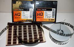
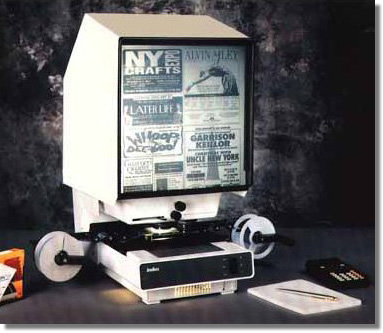
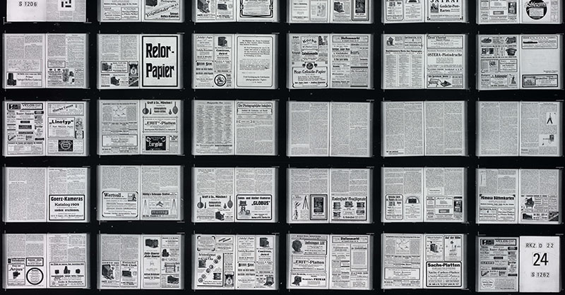
Microfilm/microfiche readers have the capability to pan and zoom filmed books and documents. Microfilm is a reel of photos, microfiche is information captured on flat transparent cards.
Often the user has access to the plate holding the screen and can pan by moving the plate itself. Reading a newspaper on a microfilm reader is quite comfortable as headlines make it easy to find relevant articles.
After a fierce patent battle in the middle of the nineteenth century microfilm readers were gradually refined. They were used by a few libraries at the end of that century. In 1904 a fire destroyed more than half of manuscripts in the National Library of Turin, so it was decided, that a photographic library would be established in all libraries. 1956 Unesco set up a microfilm unit to film all books and documents in danger of being destroyed. At the end of twentieth century microfilm readers became commonplace in most libraries.
What can we learn from this? It is not necessary to have digital technology or electricity to benefit from spatial organization of compressed information. Microfiche has easier navigation potential as it uses both horizontal and vertical axis. Finding information in a filmed newspaper can be easier than in books, because of HEADLINES. They function as both signposts and spatial anchors at the same time. They play a major role in structuring information.
1977-1978 Spatial Data Management System
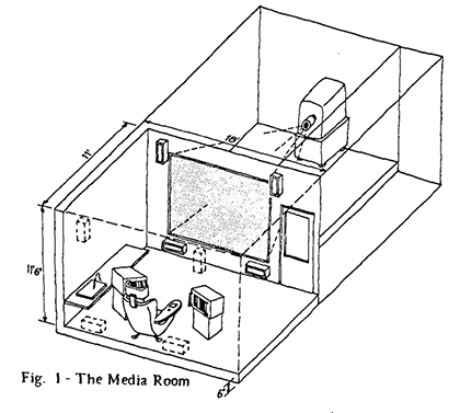
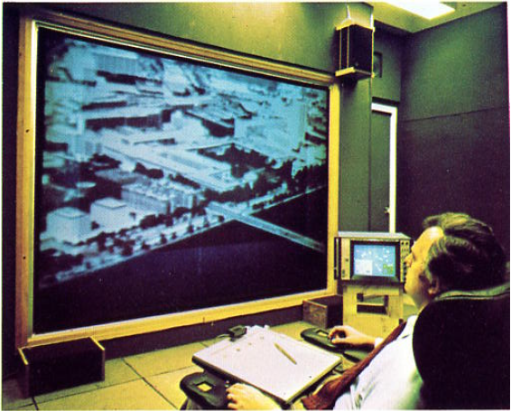
Spatial Management of Information (Spatial Data Management System) was the earliest development connected to a digital zoomable graphical interfaces. It was a joint project at MIT by William C Donelson and Dr Richard A.Bolt participated in it. It facilitated the zooming and panning of:
- Photographs, diagrams and color slides
- High quality text
- Movies, animated sequences
- Sound as data and navigational aid
- Hand written and verbal annotations
Three screens were used:
- Main Monitor, more than one meter wide
- A primary navigation screen, showing the position of the user
- A secondary navigation screen, showing details about the viewed object
The user could navigate through this virtual space using
- Two joysticks (common device that time): One on the right hand controlling horizontal and vertical navigation, the other on the left controlling depth/zooming
- The touch sensitive navigational screen
- Text could be navigated using “flipping” motions on a joypad located in one arm of the users chair
Although some technical components are obsolete, the setting itself can be considered an advanced way of Human Data Interaction, even in 2013. Elements like touch sensitive navigational screen, dedicated control for zooming, active visualisation of different data types into one virtual space were and are amazing features. “Although the current implementation is new, user response to SDMS has confirmed spatial management of information as an outstanding concept.”
Read the original Siggraph paper for more details. It is from 1978, but much of is still actual.
What can we learn from this? The nonexistence of well-trodden ways of using computers was a disadvantage and advantage at the same time. At that time only a few thousand engineers and enthusiasts were in direct contact with computer equipment. In 1977 the most common way to buy a home computer was to buy a so-called “kit” and assemble it at home. It was like a “wild west” of computer interfaces.
We were however not yet flooded with computer interfaces like desktop computers, notebooks, tablets and cell phones. This meant that not many previous paradigms had to be considered in the development process. In todays world we have a mind-blowing amount of “prior art” that has to be
- continuously searched for
- known
- used if relevant
especially by established companies. We have to have UX specialists versed in many kinds of interfaces and UI trends to create one program on one device. It is like the difference between assembling and legally using a car in 1913 or in 2013.
1991-: PAD, PAD++, JAZZ, PICCOLO2D ZUI toolkit line
According to the Piccolo site at University of Maryland, Ken Perlin — inventor of Perlin noise — at New York University came up with the initial zoomable surface concept. He and David Fox implemented the first versions of Pad (described in the 1993 SIGGRAPH paper available here).
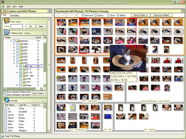
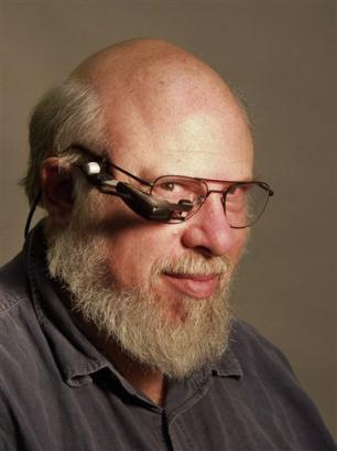
Ben Benderson and Jim Hollan developed PAD further and named it PAD++ at University of New Mexico.
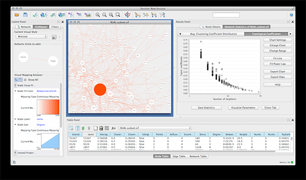
Another rewrite in Java named JAZZ was developed by Ben Benderson at University of Maryland. It was a rich toolkit and supported all kinds of features, but it grew too big and thus difficult to use. (for further details click here)
Piccolo, the current incarnation of this line is a direct successor to Jazz. It aims to embody all experience collected during the development of Pad – Padd++ and Jazz. It is still available at http://www.piccolo2d.org.
What can we learn from this? This paper goes into technical details and compares conventional inheritance based GUI models to more flexible, composition based object models. It draws the conclusion, that composition based toolkits worth the invested extra time only, if a larger, more flexible product is needed that is maintained for a long time.
2000: Humane Interface
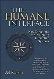
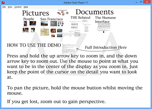
In 2000 Jeff Raskin publishes Humane Interfaces conceptualizing and propagating ZUIs. He uses the term Zooming Interface Paradigm (ZIP) to describe his system.
He finds the words “intuitive” and “natural” elusive and subjective. He states, the attachment to current “working” – window based - GUIs a major drawback in applied interaction design. Current windows based systems are compared to mazes, little rooms and doors inside with confusing labels. Instead he proposes a ZoomWorld interaction, where one has access to “an infinite plane of information having infinite resolution”.
Major properties of this field:
- “Everything is you can access is displayed somewhere on ZoomWorld, whether it is on your computer, on a local network to which your computer is attached, or on a network of networks, such as the Internet.
- The overall metaphor is one of flying, climbing to zoom out and diving to zoom in. One navigates both by flying above ZoomWorld and by doing content searches.
- This system readily permits labels to be attached to images or collections of images, yet does not impose any structure, hierarchical or otherwise beyond association due to proximity.
- One can have a number of views with the same data because screen real estate poses no problem
Primary navigation is not by scroll bars or by little zoom in/zoom out icons or menu items. Instead mouse buttons or additional graphical input devices can be used to zoom in and out for agile navigation. According to the author “The zooming interface paradigm can replace the browser, the desktop metaphor and the traditional operating system”.
What we can learn from this: A zooming interface has similar problems to other user interfaces. For example characters are too small to be easily read. The solution of changing character size instead of zooming can effectively destroy predefined layout. Maybe a system with optimized columns could work for both desktop and handheld screens. Desktops could show many columns at once while pocket-sized screens could just show one column at a time with easy navigation between columns.
Zooming speed and perceived continuousness is crucial for these interfaces. Jef Raskin proposes at least a factor of 2 per second navigation to and from the cursor position. I evaluate this as the following: by active zooming all visible artifacts gets at least double size per second without losing any frames. (Framerate should be at least 30 fps) I would add, that continuousness and seamlessness of the zooming experience is more important than the exact depiction of zoomed objects. Additional details can be rendered onto the screen later, like images can get depicted in a low resolution first and later refined.
2003-: Seadragon — Photosynth line
Technology
In 2003 a company called Sand Codex was formed by Blaise Agüera y Arcas in New Jersey and later moved to Seattle. It’s goal was to create deeply zoomable spaces where zooming navigation was fluid and transparent, regardless of content size. In 2005 two million dollars was invested into the company and then in 2006 Microsoft bought and incorporated its technology into products like Silverlight, Pivot and Photosynth. (source: http://en.wikipedia.org/wiki/Seadragon_Software )
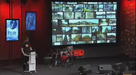
Photosynth Deep Zooming TED presentation video
Blaise Agüera y Arcas held in March 2007 - from a zooming perspective – very relevant TED talk on Photosynth and the technology behind it.
"It doesn't matter how much information we are looking at…
The only thing that ought to limit the performance of the system like this one is the number of pixels on your screen at any given moment."
He shows a digital representation of the magazine Guardian extended using deep zoom. He considers this magazine "inherently multiscale medium", which, in my interpretation, means that it is easy to navigate and zoom around.
Current state of public Microsoft zooming products as of 2013.
Silverlight — Microsoft's technology similar to the Flash plug-in—has a deep zoom control, what supports zooming navigation. There is a development tool - Deep Zoom Composer -that can generate deep zoom images. It can be exported to either:
- Silverlight Deep Zoom (DZI) format run by Silverlight plug-in
- Seadragon Ajax" format, run by theoretically any browser.
''I've created a simple zooming project and tried to run it in different browsers. IE8 runs it missing many frames, IE9 and Firefox 22.0 runs it well - only a few frames missing - Chrome 28.0 doesn't start it at all. (tests run 8.August 2013).
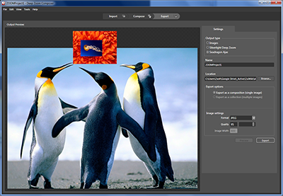
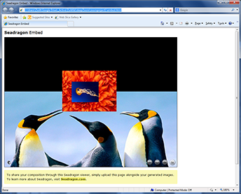
zoom.it is a site based on seadragon ajax deep zoom, what can convert a huge picture of yours into zoomable format.
As of 2013 a Photosynth app exists for iPhone, but it’s stitching algorithm has still some room to improve.
The one from Microsoft Windows 8 main menu is zoom “like”, but is basically a zooming tile menu. It seems that a certain paradigm shift is needed to reach a new level of HUMAN-DATA interaction and – as of 2013 - this has yet to happen.
What can we learn from this?
Seadragon and deep zooming tech is relevant and valuable. The demo held in 2007 showed a new way of using computers, years ahead of other graphical interfaces. Six years later we have Windows 8 what is far from this new way of using computers. Big software companies have millions of users that cannot be disappointed. That causes interface innovation to be slower and gradual. This is where small innovative companies — like Seadragon once was — come into play and can gain impressive market share.
It's a nice gesture, that the watered down deep zoom is available for everyone to try for free.
2007: iPhone comes out with pinch based zooming in Safari
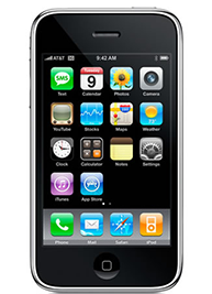
Altough the pinch gesture was know in 1983 already — video desk from Myron Krueger — it was made known to wide audiences by the iPhone, that appeared in 2007. As Human Data Interaction is evolving from desktop and notebook based interfaces to pad and pocket sized devices, these gestures have more and more relevance. There can be other touch gestures as well, but pinch has to be one of them.
Touch and other gestures will be covered in other parts of this wiki.
2007-: Prezi starts as a zooming presentation tool
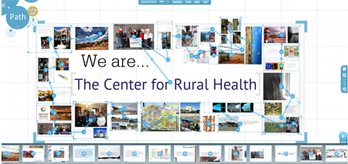
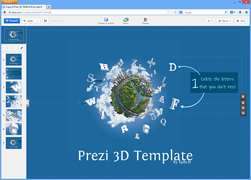
Adam Somlai-Fischer has made zooming presentations and sites starting since 2001. In 2006 he decided to create a presentation tool for others. The plan was at that time, that this tool should be not "feature-rich", but rather simple to use for everyone. He and Péter Halacsy built a presentation tool in 2007 named ZUIPrezi later renamed to Prezi. The main allegory was not a hierarchical tree, like in mind-mapping tools, but rather a map, where you can fly above or zoom into details.
They succeeded in building an easy to use and visually exciting presentation tool. Because of the thought-provoking presentations — also featured in many TED lectures — many started to use this software. August 2013 Prezi has more than 26 million users and on average more than one prezi is created every second.
What can we learn from this? Editing in an infinitely zoomable environment is difficult. Typical zooming/editing programs were CAD applications — for example AutoCAD — and these programs often needed weeks of training to use them properly, even for professionals. Prezi's goal was to create such a tool that is simple to use. And the steadily growing numbers of users clearly prove, that it works. It is not perfect, but Prezi is one workable way to edit complex infinitely zoomable environments for everyone. This is a great achievement in itself.
2008-: Eagle mode file manager and graphical environment
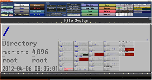
This ZUI claims to be the “most advanced Zoomable User Interface”. It is in a way advanced, because it integrates not only pictures or text boxes, but whole applications too. The application is then inherently multiscale and prepared for zooming events.
It describes some great advantages of ZUIs on its “Project Philosophy” page. These include:
- no popups, no scroll bars, no tabs
- ZUI can look the same on television, desktop and mobile
- speed up navigation, search and first of all “refinding” of objects
The Eagle Mode zooming environment is worth installing and using, but still it has not yet acquired much traction.
What can we learn from this? This technically elaborate system was designed by a developer, Oliver Hamann, who designed it to fulfil first of all his needs. For an – non existent – average user it not realistic to have X number of big horizontal buttons continuously on screen where X > 20. A great system is achieved when both zooming content and user facing interface is easy to use and navigate. Maybe this is why Prezi has much more users, although it has much less functionality.
2010-: Raskin for Mac
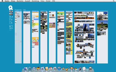
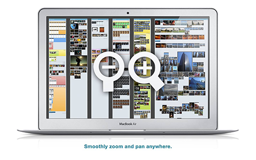
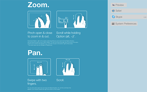
"Raskin for mac" is a desktop replacement for Macintosh computers. It got its name from Jef Raskin, author of book Humane Interface. It introduces the unified zooming navigation to OS X. Applications, documents, pictures and other files are logically mapped into a zoomable field. One can spatially reorganize objects, make them smaller/larger or give them different colors.
What can we learn from this? A good idea is to have a visible help section right next to your visual objects.
ZUI History Conclusion
I keep repeating "What can we learn from this?" for all these stages of ZUI development.
So what can we learn from all this ZUI history? My personal opinion is that what matters is if you can prove that a zoomable environment is usable for each and every user. Time spent, invested effort, bought up companies doesn't count. Words, money, marketing doesn't count. Eye candy, feature-richness, social networks doesn't count.
Flawless user experience does.
Unique Key: XZUIWIKIHISTORY
