The expression “interface design” was so hot that I immediately applied for the course. It was an inspiring eight weeks and now I would sum up my experience right here. If you speak Hungarian, you can check out the basic info here: momeid.mome.hu.
We followed the process how apps and sites are designed. It starts with “needfinding” a process to find both your and your clients needs. Some projects – actually quite many I’ve encountered – fail because of inexistent or poorly executed needfinding.
Then we continued to project brief and use cases. It was revealing to write my own specification and I could clarify the bigger part of the project without executing any direct task. This clarity helped me later on to focus on major user stories.
Then there was a part for wireframes. “No forms or colors please!” was our slogan and now I understand why. I would not do it otherwise myself.
We continued to lectures about typography and layout. As I had some experience with fonts before, so theory was almost nothing new, but the little practice we did helped a lot. Can you imagine, I didn’t really know about google.com/fonts ?
So after fixing wireframes we spent a few hours in Axure(beta). It is easy to handle although it has it’s limitations. You can digitalize your wireframes and even have some mockup funktionality. Still without colors of course.

![]()
Then came Photoshop, we fleshed out our wireframes. Of course Adobe Illustrator was a big help in creating any icons or UI elements. Actually we started by creating our own UI kit fully vector based of course. Then it was simply copy-pasting UI element into app screens.
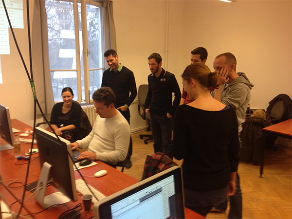
One of the surprising values I experienced here is experiencing the different viewpoints of my classmates and teachers. It’s much more than just pieces of information, it is the way people think and speak about projects or designs.
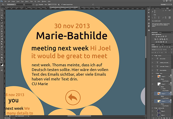
Finally I came up with a zoomable email/twitter client:
Recent Comments